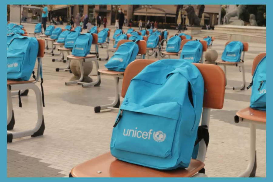
A tweet aimed at UNICEF has set social media alight, accusing the charity of stamping poverty onto children's backs. A user wrote that people were sick of the colour blue and a logo bigger than a plate, adding that little kids want Spider-Man and lollipops, not a badge that reminds them daily they are refugees and poor. The post has pulled in 103,000 likes, 5,300 retweets and 11 million views.
The contrast is intentionally strong, highlighting the playful joy of cartoons against the serious nature of institutions. Soon, the comment section divided into two groups, each arguing from genuine conviction rather than just reacting out of anger.
Why One Tweet About a Blue Bag Went Viral
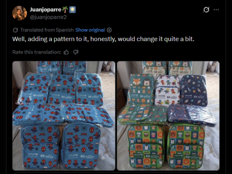
The debate gained real weight when another user replied with side-by-side photographs. On one side sat a stack of plain bags dominated by UNICEF's logo. On the other sat backpacks covered in Spider-Man webbing, plus a separate set patterned with foxes, bears and owls, each still carrying a small UNICEF tag but nothing close to as dominant.
His comment, translated from Spanish, was simple: adding a pattern would change things quite a bit. The edits were not real products, but they gave sceptics something the original tweet could not: a clear picture of what an alternative could look like.


Why Do Aid Agencies Use Such Large Logos?
Supporters of the current design say this is not vanity but protocol. Large, unmistakable logos serve a protective function in the field, signalling that an item is civilian aid.
Bold branding also deters theft, since marked goods are harder to quietly resell through corrupt channels than plain ones.
Funding plays a part too. Donors and oversight bodies want visible proof that money has reached their intended recipients.
Large logos are one of the simplest ways an organisation can demonstrate that at scale. Advocates of the current practice caution that reducing branding could make accountability harder to prove.
There's a reason for that, plus UNICEF runs on sponsors from all over the world, they need to keep the logo intact. I hope you guys know how difficult it is for them to actually go into different places, they're always targetted so pls atleast be more respectful. :((
— Cacti in bliss🌵Jungwon my heart ❤️(◝‿◜) (엔하이픈_장원) (@jungwoncacti) September 14, 2026
The Ethical Conflict in Humanitarian Aid Design
The counter-argument has nothing to do with colour choice. It is about what it feels like for a child to wear their own vulnerability on their back.
Critics say a logo-dominated bag broadcasts displacement to every classmate and stranger who sees it. The edited patterned bags gave that argument shape, showing a fox or a spider print can sit alongside a small agency tag without losing traceability.
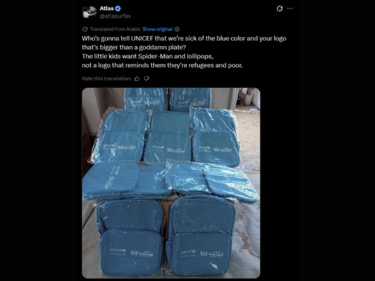
The disagreement highlights a significant divide: the need to monitor supplies to meet donor expectations versus treating displaced children as individuals rather than mere case numbers. UNICEF has yet to respond, and the gap between aid design and children's lived experiences is becoming harder to ignore.
What a Middle Ground Might Look Like
The mock-up provided structure to the debate, but the underlying idea is not new. Other humanitarian organizations already utilise smaller logos paired with playful patterns instead of branding that overshadows the entire item. They also support using internal tags or discreet identifiers that maintain tracking without turning a child's belongings into a public label.
UNICEF has not confirmed any plan to redesign its bags, and the ones currently reaching children remain plain and blue. Even so, a mocked-up image nearing five million views has done something official design reviews rarely manage: it has put the question of a child's dignity directly in front of millions of people at once.